My Role:
I worked as the UX Researcher in a three-person team, collaborating with two designers—one from my agency and another from the client’s team. I served a crucial role in analyzing user research data and converting it into practical insights to efficiently direct the design process in meeting user requirements. I collaborated with the designers to guarantee that our solutions were creative and aligned with the company’s goals. I played an instrumental part in connecting user feedback with design choices, resulting in a smoother and more user-friendly checkout process on the B2B trade application.
Challenge:
The main obstacle in the project for the B2B trading platform, particularly in the FMCG area, was the intricate and lengthy checkout procedure. The issue was that buyers currently needed to go through 9 to 10 steps to place a purchase after selecting a product. This arduous process was recognized as a major obstacle, impeding the effectiveness and contentment of the platform’s users.
Goals
The following steps and clear objectives were designed to address the main challenge of improving the checkout process, making it more efficient, and enhancing the overall user experience for the B2B trading platform’s FMCG segment.
- Optimize the Checkout Flow: The primary objective was to reduce the number of steps required to complete a purchase, thereby making the checkout process faster and more user-friendly.
- Make Key Information Consumable: This goal aimed to present important information in a clear and digestible manner, ensuring that users understand what is required of them at each step of the checkout process.
- Incorporate Multi-Seller Checkout: Recognizing the need for users to buy products from multiple sellers in one transaction, this objective focused on integrating a multi-seller checkout system to streamline the purchasing process.
- Improvise Navigation: Enhancing the navigation within the platform to allow users to move through the checkout process more intuitively and efficiently.
Approach
The approach for improving the checkout process in the FMCG segment was methodically structured around several key phases: Define, Research, Design, and Testing.
- Define: This initial phase focused on gathering insights and defining the problem statement. It involved understanding the existing checkout process and identifying the main areas of friction for users. The main issue was the lengthy checkout process that required 9-10 steps for completion.
- Research: The research phase was bifurcated into desk research and field research. Desk research aimed at understanding the domain and conducting a competitive analysis to see how other platforms manage their checkout processes. Field research involved conducting contextual interviews and usability testing to gather direct feedback from users and understand their behaviors and preferences.
- Design: This phase focused on creating wireframes and prototypes based on the insights gathered from the research phase. The goal here was to design a more streamlined and efficient checkout process that addressed the pain points identified during the research.
- Testing: The final phase involved prototype testing and hypothesis validation to ensure that the new design effectively addressed the users’ needs and improved the overall checkout experience.
Study Details:
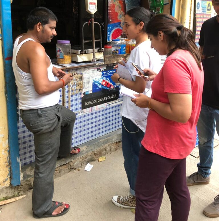
We conducted field study in two major Indian cities in August 2019. We interacted with 5 participants in Bengaluru, namely in the Marathalli area, to collect initial requirements and assess the existing checkout process. In Gurugram, specifically in Sarhol and Jharsa village, we increased our participant group to 12 participants to focus on verifying the improvements made to the checkout process.
Our study encompassed a diverse participant demographics of total 17 participants, ranging in age from 20 to 50 years. Their educational backgrounds were varied, predominantly up to matriculation level, with a few holding postgraduate diplomas. This provided a broad perspective on the user experience across different educational spectrums. Participants represented various types of retail environments, from small to medium-sized HoReCa establishments to large retail shops, ensuring that the feedback and insights collected were well-rounded and reflective of the platform’s diverse user base.
Methodology Undertaken:
The methodology employed included contextual inquiries paired with competitive usability testing.
- Contextual inquiries were conducted by observing users in their natural working environment, combining direct observation with semi-structured interviews. This approach allowed the team to gather in-depth insights into the users’ natural interactions with the platform, their workflows, and the specific challenges they faced during the checkout process.
- Competitive usability testing involved comparing the platform’s performance against its competitors, focusing on usability metrics and specific features to identify areas of improvement and innovation.

In Bengaluru, the research aimed at gathering initial requirements and understanding the current checkout experience from the users’ perspective. This involved observing and interviewing users about their ordering habits, preferences, and feedback on the existing checkout process. In Gurugram, the focus shifted towards validating the redesigned checkout flow. Users were observed and interviewed to assess the impact of the changes implemented, with particular attention to usability, efficiency, and overall satisfaction.
The insights gathered were instrumental in identifying key pain points in the existing checkout process and validating the effectiveness of the redesigned process. The objective was to ensure that the new checkout process addressed the users’ needs, reduced complexities, and provided a more streamlined and satisfying user experience. By directly involving users from the target demographic in the research and validation phases, the project aimed to create a more intuitive, efficient, and user-friendly checkout process, ultimately enhancing the overall user experience on the platform.
Artifacts
For both research and design aspects of the project aimed at enhancing the checkout process, a variety of artifacts were produced to facilitate understanding, communication, and solution development:

1 Research Artifacts:
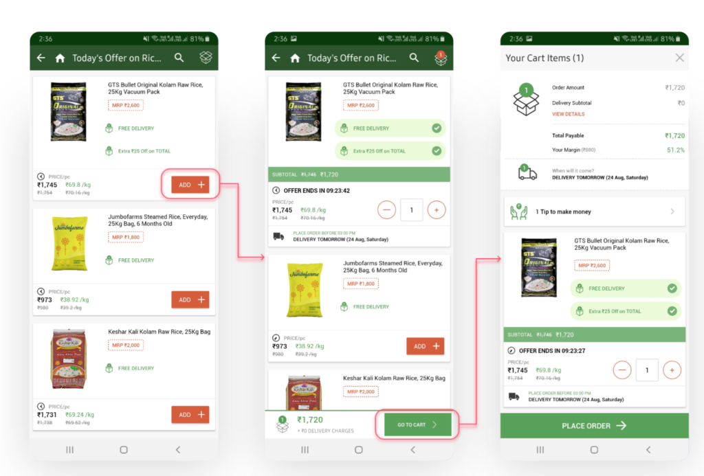
- Desk Research: The team extensively reviewed existing data, studies, and competitive platforms. This included a competitive analysis to identify the market’s strengths and weaknesses, helping inform our approach and design decisions.Image for Competitive Analysis of a competitor app called Jumbo Tail
- Field Research Documentation: Detailed notes, audio recordings, and transcripts from contextual inquiries, interviews, and usability tests conducted in Bengaluru and Gurugram. This included user profiles, their buying behaviors, preferences, and feedback on the existing checkout process.
- Insights and Recommendations Report: A comprehensive document summarizing key findings from the research, including user pain points, preferences, and recommended changes to improve the checkout experience.
- Usability Testing Reports: Documentation of the testing process, methodologies, participant feedback, and design iterations based on this feedback. This also included video recordings and analysis of user interactions with the prototype.
2 Design Artifacts:
- Wireframes and Mockups: Early, low-fidelity representations of the proposed design changes, focusing on streamlining the checkout process. These were used to visualize and discuss ideas within the team and with stakeholders.
- Prototypes: Interactive high-fidelity prototypes developed based on research insights and feedback. These were used in further usability testing to validate design decisions and understand user interactions with the new checkout flow.
- Design Specifications: Detailed documents and guides describing the visual design, user interaction, and front-end coding requirements for implementing the redesigned checkout process.
These artifacts were crucial in bridging the gap between research insights and tangible design solutions, facilitating a user-centered approach to improving the checkout process.
Solutioning and Iterative Prototyping:
During this phase, we engaged in a cyclical process of design evolution. This phase involved creating early prototypes that were tested by users to receive feedback. Using feedback, we continuously improved our designs to address customer issues and simplify the checkout experience. Using the iterative method enabled us to refine our solutions gradually to closely match consumer demands and expectations.
Iterative low fidelity wireframes
The main tasks involved streamlining the navigation, improving the prominence of crucial information like pricing and product descriptions, and minimizing the number of steps in the checkout procedure. Following a systematic approach to testing and improving, a more user-friendly and efficient checkout procedure was developed to overcome the difficulties identified in our research.

Learnings
We developed a detailed list of assumptions during the research and design phases aimed at improving the checkout process, drawing from our initial research findings. The list was created to evaluate fundamental assumptions regarding user behavior and preferences. Among these, Hypotheses A, D, and F stood out as particularly significant following our field studies and user testing sessions.
Hypothesis A posited that users might find it easier to complete the checkout flow within three steps. This hypothesis aimed to simplify the checkout process, reducing user fatigue and potential drop-off. The validation process, particularly in Gurugram, supported this, as users preferred a streamlined approach, emphasizing the need for efficiency in e-commerce transactions.
- Recommendations based on these insights included the localization of CTAs to assist users with language barriers and enhance clarity on the actions being performed. Furthermore, the observation that most users operated a single shop and rarely changed their delivery address informed our design to merge the delivery address selection with the cart page, streamlining the process further.

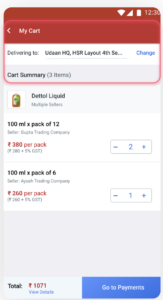
Hypothesis D suggested that merging the delivery address with the cart page could help reduce steps in the checkout flow. Insights from Bengaluru and Gurugram indicated that most users typically operated from a single shop and did not frequently change their delivery address, thus validating the hypothesis that integrating the delivery address into the cart page streamlines the process.
- Recommendations were made to reassess the presentation of total costs and GST breakdowns, as users overlooked the “View Details” option and had mixed responses about the visibility of GST information.

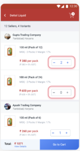
Hypothesis F addressed the preference for a multi-seller checkout. Users expressed a clear preference for this feature, highlighting the importance of flexibility and efficiency in managing orders from different sellers within a single checkout process.
- Further recommendations included improving feedback mechanisms for user actions, like adding items to the cart, and simplifying jargon such as “MOQ” (Minimum Order Quantity) to “Min Quantity” for better user comprehension.
Overall, a variety of elements such as cost, brand, seller reputation, and customer preferences were shown to affect purchase decisions, according to general observations. Users displayed a wide range of behaviors when searching for and selecting products, with some being unhappy with the credit system. This highlights the importance of improving communication about payment methods.
The findings and recommendations were intended to enhance the checkout process by making it more intuitive, efficient, and aligned with user expectations, greatly influencing the project’s direction and design results.

Impact:
The impact of this study was significant and multifaceted. Firstly, redesigning the checkout process led to tangible improvements in user satisfaction and efficiency. Post-implementation metrics showed that checkout times were reduced by an average of 43%, directly attributing to a smoother and faster user experience [Based on experiments done in October 2019]. This improvement in efficiency not only enhanced user satisfaction but also contributed to an increase in conversion rates, as the streamlined process reduced cart abandonment rates.
This project’s success catalyzed a broader recognition of our agency’s capabilities, resulting in additional engagements from the trading hub. My contributions were pivotal in demonstrating our agency’s competence in delivering user-centered design solutions that drive business results, reinforcing our reputation as leaders in e-commerce platform design. This experience has been instrumental in positioning both myself and our agency at the forefront of innovative UX design solutions in the sector.